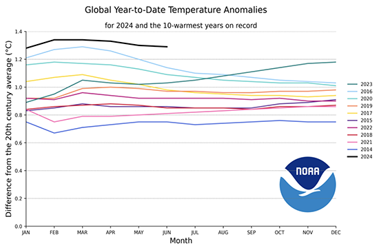
THE GLOBAL ENERGY DEMAND CURVE GETS A REALITY CHECK By Berit Anderson Why Read: Current scenarios of energy demand are almost universally inconclusive - or simply wrong. This week's Global Report brings you the Energy Reality Curve - the most likely shape of energy demand in the years ahead. - BBA _________ The announcement, when it came, wasn't even that big, especially considering the magnitude of the event. Scientists had been talking about it for years. A warning. An anticipatory red flash of danger. So when a friend dropped the news casually into conversation back in February - "Oh, by the way, we've officially passed 1.5 degrees C" - it felt more like a whimper than the bang I'd been expecting. That couldn't be right. Shouldn't we all have gotten an Amber Alert or something? Unfortunately, it was. Per the Washington Post, in a report dated February 8: "According to the European Union's Copernicus Climate Change Service, the past 12 months clocked in at a scorching 1.52 degrees Celsius (2.74 degrees Fahrenheit) higher on average compared with between 1850 and 1900." The Post, of course, was quick to note that this doesn't really mean we've "hit" 1.5 degrees. To meet scientific standards, it would need to happen again this year, and last year was a bad year, and yada yada yada. But despite all their journalistic ums and ahs, we have, in fact, hit 1.5 degrees C of warming. And it's looking like we will again this year:
So, what does this mean about how to project global energy use? Well, there are a lot of energy demand "scenarios" out there to get us started. |


